
Swisse is a premium Australian wellness brand with a presence across Australia, Asia, the Middle East, Europe, and the US.
Swisse Wellness is most popular for its premium multivitamins, dietary supplements, and beauty-from-within products like Glutathione, Fish oil, Liver detox, Collagen shots, and more.
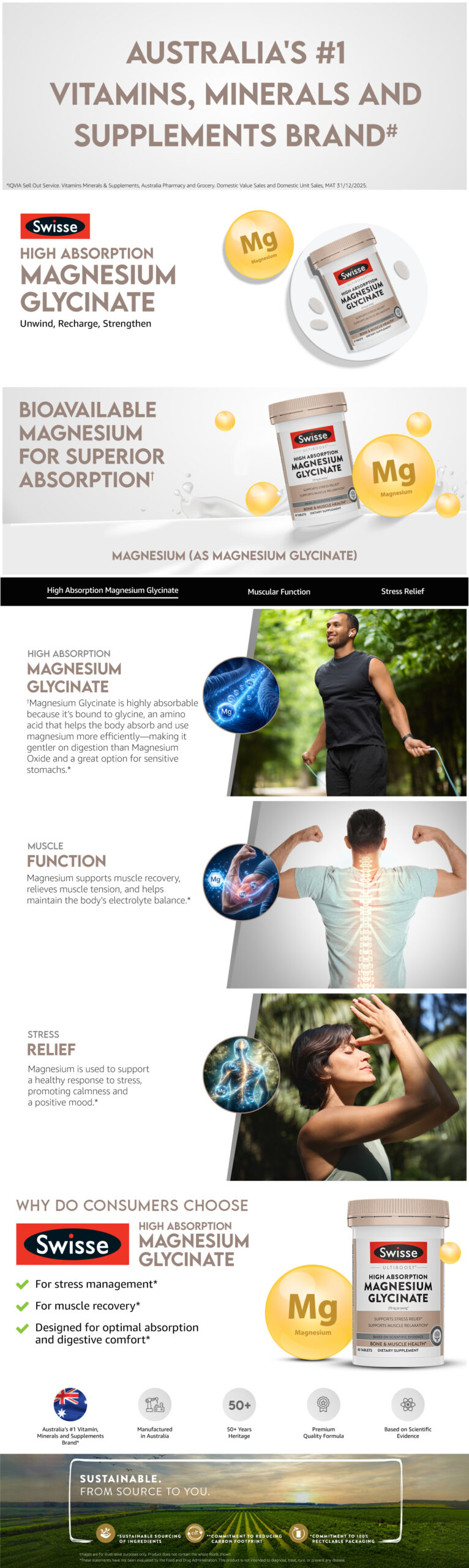
Create Amazon A+ Content for Swisse’s health supplements range for the US market. Brand awareness and education are to be prioritised. Swisse Wellness wanted to build trust with a very diverse target audience, while staying fully compliant with FDA guidelines.
Buying supplements isn’t an impulse decision. People compare ingredients, read benefits, look for proof, and spend time understanding what they’re putting into their bodies.
For Swisse, the challenge was establishing an Australian brand to US consumers in a way that felt trustworthy, transparent, and the right choice for the TG, while using the right communication to convey product benefits within FDA regulations.
We knew this category wasn’t about flashy visuals. It was about helping people feel confident in choosing Swisse Wellness products. We identified 4 main questions that need to be addressed through Amazon A+ and B+ assets.
1. Can I trust the brand? = Brand expertise & transparency
So we started with establishing credibility first.
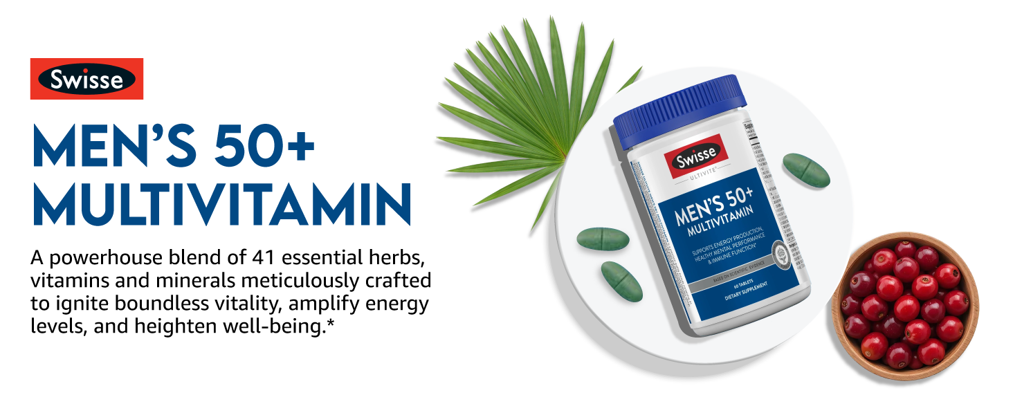
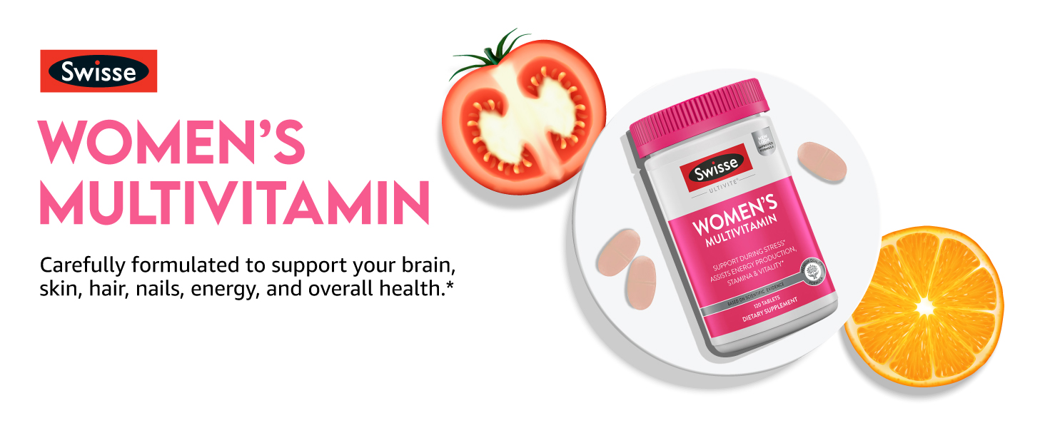
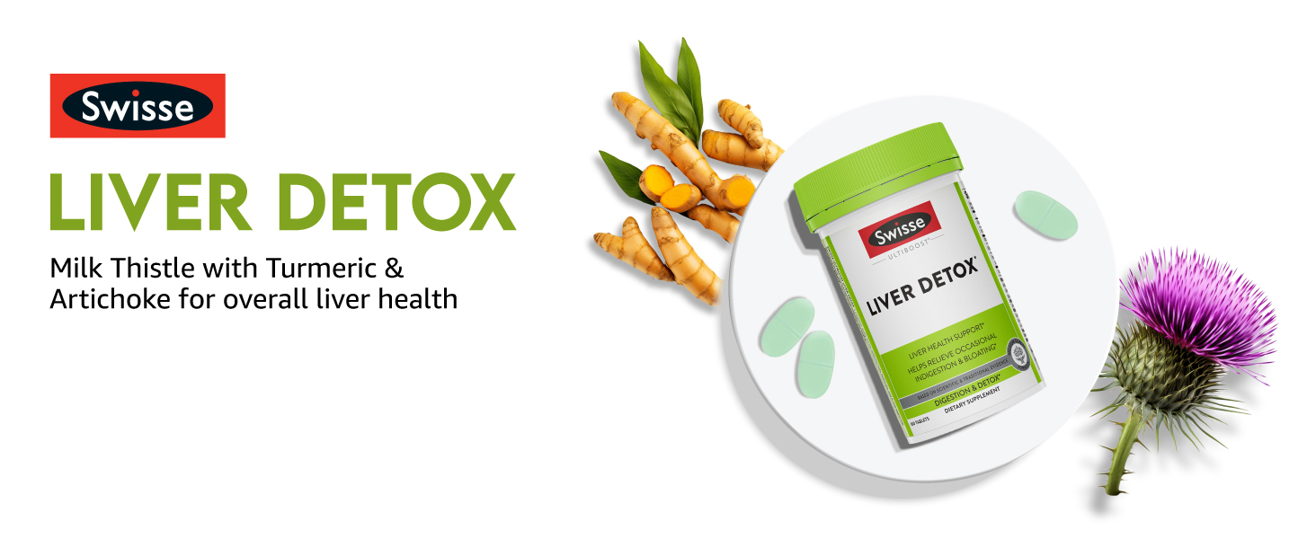
A clean, minimal visual language kept the focus on the product to create higher product recognition.
2. What does it have? = Ingredients
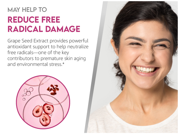
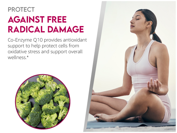
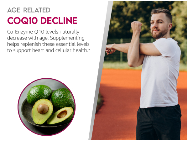
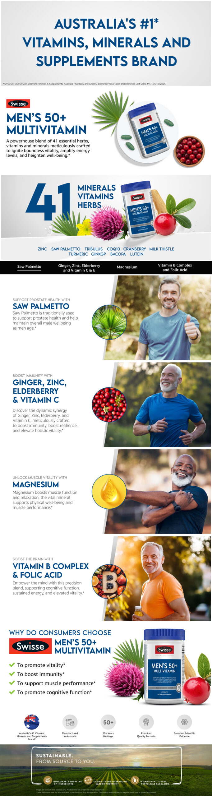
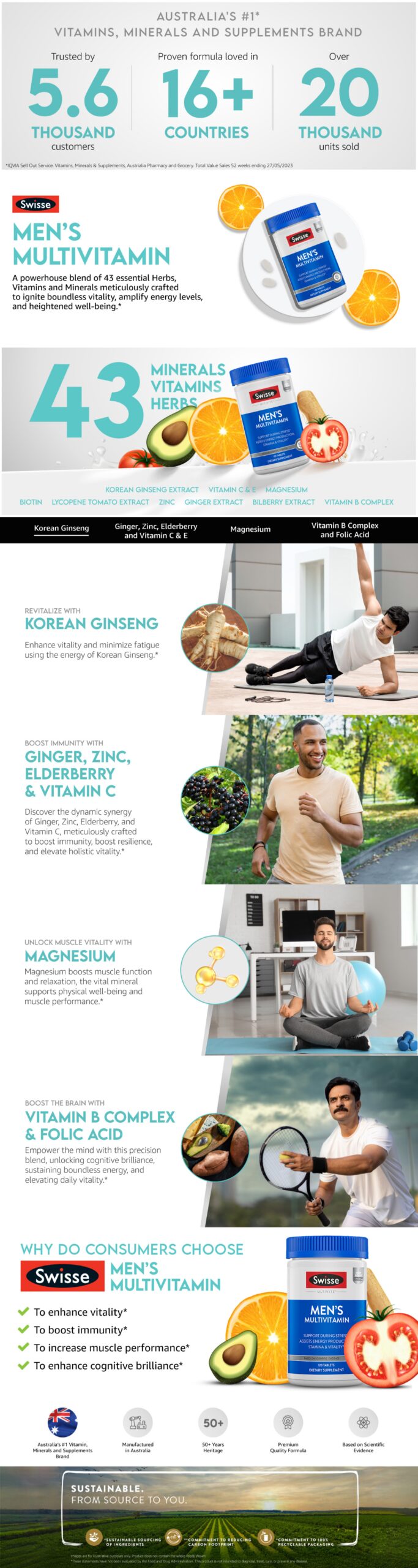
So rather than simply listing ingredients, we brought them to life visually. This helped consumers connect product benefits with what’s actually inside the bottle.
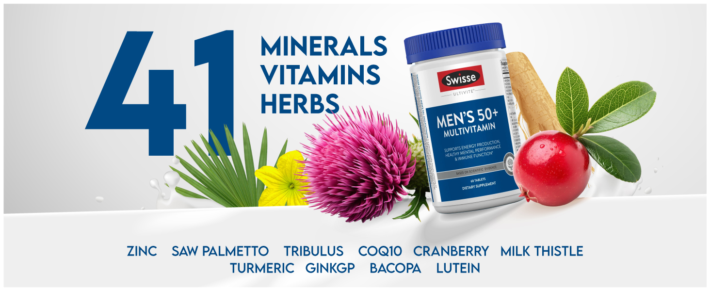
3. What does it do? = Benefits
The communication stayed benefit-led and educational throughout. Instead of emotional messaging, every section was designed to answer a question, simplify information, or make product comparison easier.
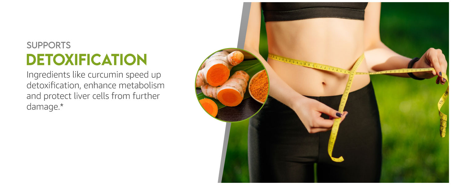
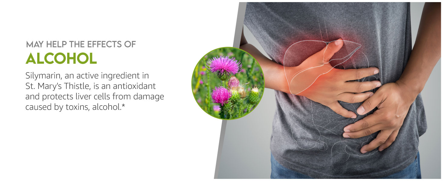
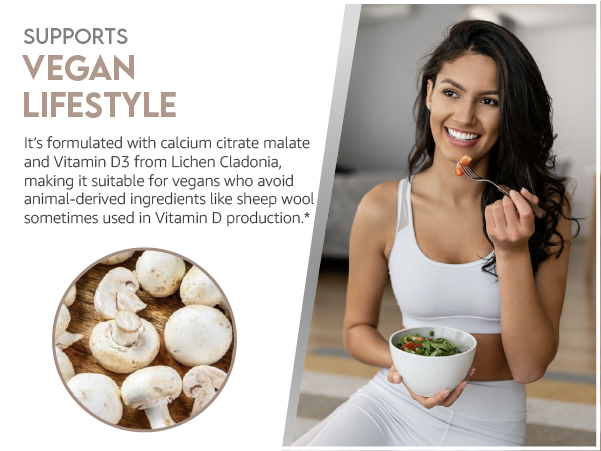
4. Is it right for me? = Consumer relevance
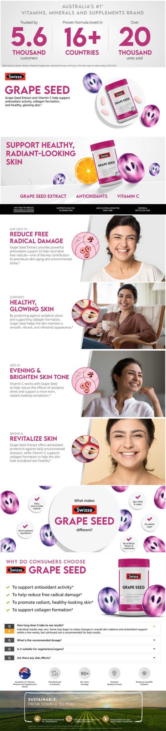
We featured people from diverse ethnic backgrounds across the banners to reflect the multicultural US audience, making the brand feel more relatable and inclusive.
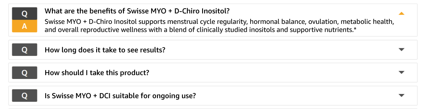
Consumer Journey Optimisation: One of our priorities was to keep consumers within the Amazon buying journey. Consumers should not have to leave the product page for research or comparisons at Google or ChatGPT, so we recommend using Amazon’s built-in FAQ section.
Drawing from category research and consumer behaviour, we identified the most relevant questions around ingredients, usage, and benefits so shoppers could find answers without leaving the page.
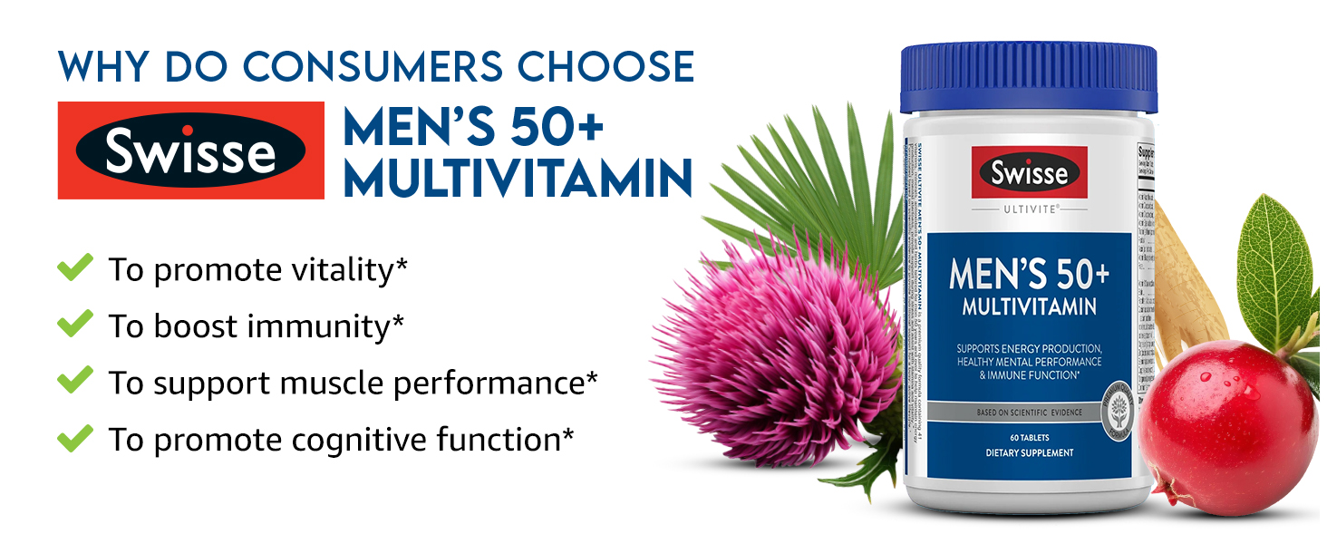
Lastly, but most importantly, every headline, visual, and benefit statement was reviewed to ensure FDA compliance without compromising clear communication.
We created a scalable A+ content system that could be extended across the supplements product portfolio.
Simple design and informative content encouraged shoppers to spend more time exploring the brand and make informed purchase decisions.
Amazon A+ Content should never be one-size-fits-all. The communication and design should be tailored to the category, the geographical market, and the consumer. Understanding how people shop, compare, and make decisions is essential to creating content that builds trust and drives conversions.
Good design catches attention, and the right communication drives action.
If you’re looking to create marketing assets that are clear, compelling, and built to convert, let’s talk.